Thursday, 18 February 2010
FeelGood Animatic
Here's the animatic using the edited storyboard. I plan for the animation to last just over 30 seconds, since that seems to be standard TV advert time.
Wednesday, 17 February 2010
Storyboard Edit
After looking over my original storyboard a few times and doing some mental planning, I think I was probably a bit too ambitious to include so many scenes considering the time frame I have to produce this piece. I've also come to realize that several of my scenes aren't necessary to tell the story and just drag it out, which is never good for a TV advert. So I've decided to cut a few parts from the end, mainly the inclusion of the geyser. A geyser isn't needed to shower the people in Feel Good juice, that can happen simply from the bottle tipping upside down midair, especially if the drink is fizzy. I've also cut out the end shot of the original character catching the bottle and the bottle filling up again in his hand; again, its unnecessary and doesn't really serve any purpose other than to fill out time. Also by having the character sat in the same position as the logo at the end, I can fade the character straight to the logo/pack shot which I think will look much smoother.
.jpg)
.jpg)
.jpg)
.jpg)


Initial Ideas and Character Sketches
My idea is to show the Feel Good character on some kind of adventure or pilgrimage to discover the source of 'feelgoodness' and bring it back to his people, similar to how religious figures, archaeologists, or even video game heroes trying to save the world might if the need was great enough. I was primarily inspired by Aladdin and the Cave of Wonders where the Genie's lamp rest atop a tall stone pillar with steps leading up to it and water below, a setting I hope to imitate in my own work. I especially like how the darkness with the single beam illuminating the treasure gives the impressions of how sacred and wonderful it really is.


I also looked at Indiana Jones and The Legend of Zelda video games for inspiration on how character obtain 'sacred' or magical items. I especially love how Link (in the Zelda games), has the item in question hover above his upraised hands, glowing in splendor as if its a gift from the heavens. The camera looking down from above in these cases makes these shots look interesting and emphasizes how the item is 'above' and thus somehow greater than the hero claiming it.


Below are my initial character sketches, trying to get used to the Feel Good logo character. Due to his long, thin, simple shape, I feel that there's the potential to do a lot of interesting things with him, especially considering how he's almost a complete silhouette. I was trying to imagine him in the role of a video game hero on a quest for 'feelgoodness', so I imagined how he could use real fruits to aid him on his quest against artificial colours and flavours, an issue brought up frequently in the project brief.

After thinking about the video game quest concept some more, I developed the idea into retrieving the sacred bottle of feelgoodness, only to accidently lose it again. Rather than taking the idea seriously, I want to poke fun at the build up of drama and suspense that often occurs before finally obtaining such an item. I'm hoping it'll be amusing enough to raise a smile, which is what Feel Good drinks are all about.


I want the style of animation to be a bit on the rough side to give a playful, hand drawn look, almost as though its been done by kids. If its too tight and perfect I think it will look too serious and lose a lot of its charm. The whole idea is supposed to be humorous and a bit tongue in cheek, so I want the style of drawing to convey that. To get into the right frame of mind I drew the above concept images with charcoal and pastel, and I really like how they turned out. In flash I should be able to enhance the colours further to make everything brighter and much more vivid. I also plan to keep things such as the juice falling as simple and child-like as possible by animating large cartoony droplets rather than realistic looking rain.
Tuesday, 16 February 2010
Moodboards


To get a feel for the 'Feel Good' tone of voice and the atmosphere they try to invoke with their products, I started by studying their website and company blog. The first thing that struck me is that their overall design and visual style looks very handmade. Each individual image seems to be a cut out either stuck down with tape or suspended from the sky with string; with the different layers of images moving and rotating behind each other to give the feel of depth, almost like a child's mobile. I really like this approach as it makes the site look very sweet and charming; almost innocent in its childish simplicity. This ties in well to the overall theme of all natural flavours and no artificial sweeteners or added sugar.
Below is the first if my moodboards; this being one for the company itself, the packaging of the products the brief wants me to focus on, and the cheeky visual style that's been used in previous animated advertisements for their drinks.
.jpg)
This moodboard shows the style of graphics previous competition entrants have gone for while working on this brief. They've all gone for very bright, cheerful, and quirky imagery to fit with the brand's theme.
+copy.jpg)
Target audience moodboard showing the types of people likely to purchase Feel Good drinks and what I imagine their typical lifestyle to be like. According to the brief, the drinks are aimed at 16-34 year olds; people who are old enough to want to take care of their bodies and appreciate the benefits of a healthier, better tasting drink, and so don't mind paying a little extra for it. From this we can assume that the target audience would also be health-conscious people who lead fairly active lifestyles and take part in various outdoor activities both for fun and to keep in shape. They're hard working but still enjoy being sociable and having a good time; suggesting they're either students out of high school and experiencing the world for the first time (student loans = money to buy slightly more expensive drinks!) like in university, or they've already left education and have succeeded in finding a well paying job. And naturally, they're most likely a little on the quirky side, choosing to see things in a positive light so they can make the most of any situation, while poking fun at things that don't go quite as planned. For this moodboard I took quite a few images from the Feel Good Drinks Flickr site where their customers sent in photos of their own feel good experiences, so I know for certain that a fair few of my images are of real Feel Good drinkers.
+copy.jpg)
This moodboard shows the feel of the design I'm hoping to go for, using cave drawings as my inspiration. I want the style of the animation to be light, sketchy and playful to imitate the charm of the hand made cut out theme of the website. While cave drawings can often come across as quite dark and intense, often depicting battles and men hunting beasts, I feel the simple stick men scratched into the rock draws a parallel with the stick man-silhouette character of the Feel Good logo, so I'm hoping I can adapt the style into something more cheery and child-like while keeping the sketchy characters in tact. I also looked at geysers and fountains to get an idea of how the Feel Good juice could shower down on people, which I thought could be a nice, fun idea to show the characters reveling in the 'feelgoodness'.
+copy.jpg)
Mind Map

Initial thought process while trying to come up with a suitable idea. I wanted to keep the feel of everything very fun, playful, and somewhat cheeky to blend with the 'Feel Good' brand, so I toyed around with ideas involving games and simple things children find facinating like bubbles and balloons. I also tried to tie in the concept of natural fruit flavours and no artifical colours or ingredients, making the real fruit the 'good guys' and the artificial flavours the 'bad guys' so to speak.
Feel Good Research 2
Some more examples of the work produced by students for the previous Feel Good competition briefs, this time looking at the graphics side rather than just animation.


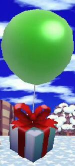
One idea I particularly liked was releasing balloons with colours matching the fruits used in Feel Good drinks into the sky. As you can see below, some people actually made fruity tags and wrote feelgood messages on both those and the balloons themselves before letting them fly away, so through the balloons they are quite literally spreading the feelgoodness. Personally I think its an absolutely lovely idea; the sight of balloons floating through the sky invokes such a feeling of freedom and childish joy, almost making you want to chase them down and try catching one yourself. I can only imagine how awesome it would be to randomly find a balloon stuck in a tree one day with a feelgood message attached, especially if I was feeling rather down that day. Its like being given an unexpected gift!


This idea lead me to think of a similar instance in a game series called Animal Crossing, were occassionally random balloons bearing presants would float over head. Naturally your first thought is what on earth could the present be, so your intitial reaction is to chase. Depending on the game you either had to hope the present got stuck in a tree so you could shake it down, or fire at the balloon with a sling shot to pop it and make the present fall; and the excitement and anticipation you feel when attempting to obtain the present before the balloon flies away is childish beyond belief! I thought it might be nice to center my animation around this idea of speading joy through balloons, perhaps with the logo character having to chase a present in a similar way the player does in these games, and the trials he has to go through to get it in the end... But after giving it more thought, I've decided it'll probably be too similar to what's already been done and I don't want to look like I've copied a previous idea, as lovely as it is. I think it'll be better to develop my other ideas involving gameplay mechanics to come up with my own way of spreadng the feelgoodness.

One idea I particularly liked was releasing balloons with colours matching the fruits used in Feel Good drinks into the sky. As you can see below, some people actually made fruity tags and wrote feelgood messages on both those and the balloons themselves before letting them fly away, so through the balloons they are quite literally spreading the feelgoodness. Personally I think its an absolutely lovely idea; the sight of balloons floating through the sky invokes such a feeling of freedom and childish joy, almost making you want to chase them down and try catching one yourself. I can only imagine how awesome it would be to randomly find a balloon stuck in a tree one day with a feelgood message attached, especially if I was feeling rather down that day. Its like being given an unexpected gift!
This idea lead me to think of a similar instance in a game series called Animal Crossing, were occassionally random balloons bearing presants would float over head. Naturally your first thought is what on earth could the present be, so your intitial reaction is to chase. Depending on the game you either had to hope the present got stuck in a tree so you could shake it down, or fire at the balloon with a sling shot to pop it and make the present fall; and the excitement and anticipation you feel when attempting to obtain the present before the balloon flies away is childish beyond belief! I thought it might be nice to center my animation around this idea of speading joy through balloons, perhaps with the logo character having to chase a present in a similar way the player does in these games, and the trials he has to go through to get it in the end... But after giving it more thought, I've decided it'll probably be too similar to what's already been done and I don't want to look like I've copied a previous idea, as lovely as it is. I think it'll be better to develop my other ideas involving gameplay mechanics to come up with my own way of spreadng the feelgoodness.
Feel Good Research
I started off my research by looking at past YCN student competition entries for this brief and other animated adverts for Feel Good Drinks so as to better understand the type of style and humour they enjoy and find appropriate for promoting their product. The first I looked at was the winner of last year's competition, Debbie Hulme, who created a stop motion animation featuring gnomes. Her original animation was very rough and simple, yet the people at Feel Good Drink loved the gnomes quirky charm so much that they hired professional animators to adapt the idea into a full, more polished advert. While the gnome concept isn't particularly laugh-out-loud funny, its certainly very endearing since they make unusual mascots for a healthy drink. I suppose this proves that an idea needn't be complex to bring a smile to your face. Below is the final TV Advertisement, followed by the shorter, original piece by Debbie.
Next I looked at the TV adverts used prior to the birth of the gnomes, which involved the Feel Good Drinks bottle bouncing around and dodging the artificial ingredients/sugar. They're very short, cute, and to the point; getting the message across immediately while being just unusual enough to bring a smile to your face in the process.
In terms of animation the next advert isn't especially impressive, but its a fun little idea showing sugar to be the enemy trying to infiltrate the Feel Good bottle, only to be foiled in the last minute. Personifying the sugar and fruit like this is a nice trick often used in animation, so its good to see that the Feel Good team respond favourably to quirky gimmicks like this.
The final two adverts are just sheer, silly, good natured fun. They tell little to nothing of the drinks' ingredients or the benefits of choosing Feel Good drinks over other brands, instead choosing to focus purely on the idea of 'Spreading the Feelgoodness'. I think the first one works surprisingly well for an X Factor parody, and it certainly made me laugh when I first watched it. If a bottle of juice with a wig can make you laugh, then its obviously done its job by making you feel good. What more do you need to know?
Below are the advertisements for some of the competing brands of healthy drinks, though none share the Feel Good quirkiness that gives the Feel Good Drinks their charm. The Firefly Tonics are portrayed in a much more elegant, sophisticated way, perhaps suggesting a wealthier target audience.
The adverts for Vitamin Water revolve around sportsmen drinking the water and things happening out of the ordinary, with a commentator describing the events as though it's being broadcasted on TV. To be honest I find this way of advertising rather dull and difficult to follow, and it took a few watches for me to get the point they were trying to get across since (to me) its not very clear.
The final advert is one for Volvic Mineral Water, which I've included because it has such a delightfully funny twist. The way it blatantly makes fun of the priorities of a man's mind and mocks the invention of something as revolutionary as the wheel is very cheeky and brings a smile every time I watch it, which is what the Feel Good brief wants to achieve. I think I'd also like my advert to mock something that initially seems serious or dramatic, and the cave men time period has made me think of how similar the Feel Good logo character looks to the stick men in cave drawings... Perhaps I can find a way to develop or incorporate this style into my work.
Feel Good Drinks (YCN Competition Brief)
For this project I will be following a live brief from the YCN Student Awards site for Feel Good Drinks. You can find the brief here. Since the logo features a stick man sitting in some sort of meditating position, I was thinking it might be nice to incorporate him into the animation somehow... After all, if the brand already has a iconic character, why come up with a new one? The idea of the brief is to make Feel Good drinks more well known and spread the word, so I think using the logo character would be an effective way of doing that since people are more likely to relate him to the Feel Good Drinks labels than a character that has no link to the product at all.
Subscribe to:
Posts (Atom)