Concept art from the game Okami. The sides of the cliff are accented using dark lines and rough shading.
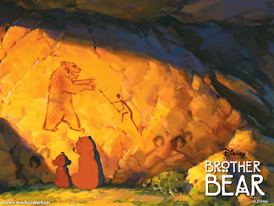
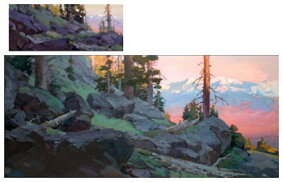
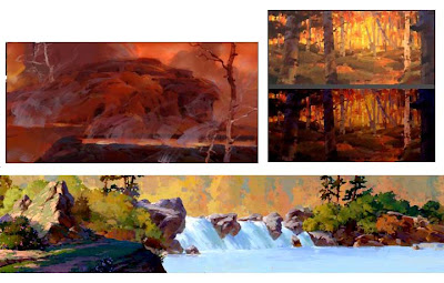
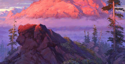
Concept art from the Disney film, Brother Bear. More rough, painterly shading in blotches to show the uneven surface of the rocks.
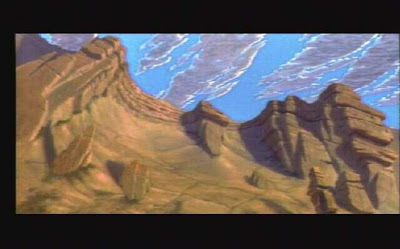
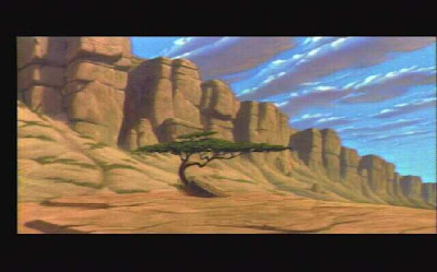
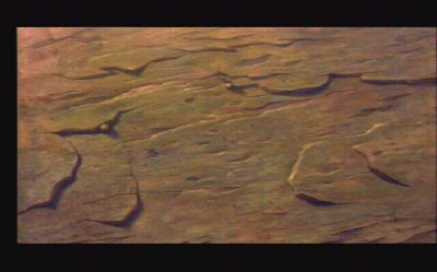
Background art of the gorge from The Lion King.
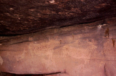
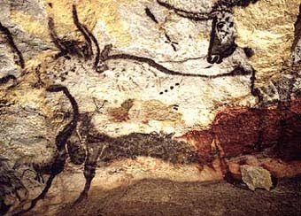
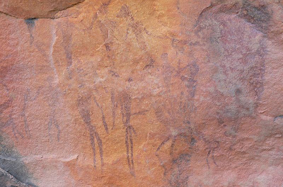
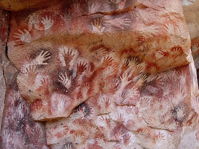
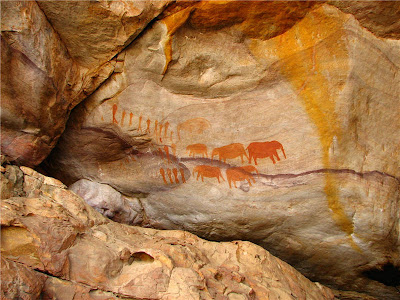
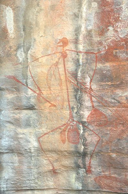
Photos from various caves around the world.
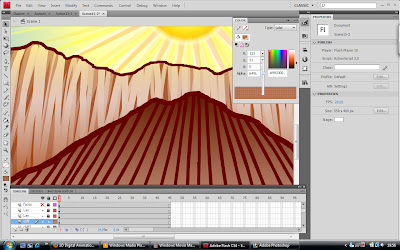
After studying the above images I decided to separate the two most common methods of rock detailing (jagged dark lines and rough shading): I used long, fairly straight dark lines to hatch the under side of the cliff, making it appear a lot more shadowy and possibly giving it some much needed perspective. I then quickly hatched the upper wall of the cliff using many different opacities of the same shade of brown so they all overlapped each other, and used a small eraser to quickly and randomly rub out vertical-ish lines to let some of the original gradient shine through underneath. I think the result looks pretty good, as the cliff now has multiple tones and appears to have both light and dark crevices all over. While its not a great deal of change, I think this amount of detail is enough to easily differentiate the levels of rock on the cliff while making it look more interesting to look at as a whole. Any more detail would risk the characters being lost in the confusion, especially with so much else going on.
No comments:
Post a Comment