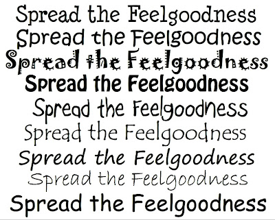
To find a font for the shrine sign I first started by looking through all the available fonts in my version of Flash. Most of them were far too dull and business like to be suitable; the Feel Good brand is all about fun quirkiness, cutting lose, relaxing, and generally feeling good. Most basic fonts are too boring to stir any kind of emotion as they're made purely to be functional and readable rather than decorative. With that in mind I focused my search on fonts that appeared hand written or had a happy looking design. Above are the ones I narrowed it down to, one of which is the template I used for the writing that appears at the end of the animation under the bottle. None of them really strike me as being especially 'feel good', though... at least not enough to be used on the sign. I'm happy with the slogan at the end of the animation as it is since it's supposed to look like its being written on the screen as you watch it (I wrote over the font to make sure the letters remained neat and professional looking while still appearing hand written), but I think the font used on the sign needs to have more of a connection with the Feel Good brand itself. With that in mind I went back to the Feel Good website to see what fonts they typically use there.

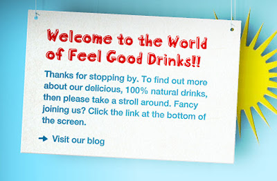
The red font shown above seems to be the favoured font of the Feel Good Drinks company, as its used for all the titles on their website, making it perfect to use for the sign if only I could find it somewhere. Unfortunately the website doesn't name this font anywhere and the competition project pack available for download doesn't include it, so I've had to use the next best thing. After much searching through fonts online, green piloww is the closest I can find the Feel Good font.

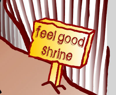
I screen captured a preview of the words I wanted from the site linked above and recoloured them in Photoshop to match the brown colour of the sign outline, since the original black looked rather out of place. Unfortunately green piloww doesn't have any capital letters wheras the Feel Good font used on the website does, but I think it's acceptable to have it all in lower case since the Feel Good logo on the actual bottle doesn't use capital letters either, so hopefully it still looks fine. In the end I decided to change 'Shrine of Feelgoodness' to just 'Feel Good Shrine' since the feelgoodness slogan is already shown as the strap line under the pack shot of the product at the end. I think the slogan will have more impact if the end of the animation is the first time you see it rather than have it pop up at the beginning as well, plus 'Feel Good Shrine' sounds closer to 'Feel Good Drinks'.


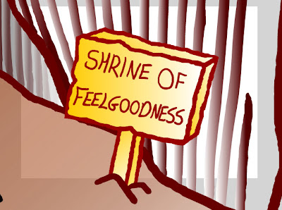
Above you can see the comparison between the old sign in the previous version of the advert and the new one I've just made. I think the font looks a lot neater and more professional, but at the same time still retains its hand-drawn feel and keeps the Feel Good brand atmosphere. I also like how it almost appears to be carved into the wood due to the scratchy nature of the font.
No comments:
Post a Comment