The Feel Good drinks project has been a challenge from start to finish, but ultimately an enjoyable one. At the start it was my first time working on a live brief for an actual client, and it proved to be a lot different from the briefs created by the university tutors which are usually based around the idea of showcasing what you’ve learned throughout the module. In this case however, the client expects you to already know what you’re doing and to create something that could actually be used in real world promotion; something finished and polished. So far all my projects have still been quite rough even at the point of ‘completion’, all of them lacking sound and having various cut backs due to time constraints and deadline pressure.
Admittedly the Feel Good project was no different in that respect, as when the deadline for the contest came I still had not managed to produce an animation near enough completion to make a serious competition entry. This was due to various factors; the primary one being me underestimating the time it would take not only to animate the character frame by frame, but also to create convincing backgrounds and search for suitable sound effects. Up until now I have only ever had to worry about character animation alone, usually leaving them either hanging in the white void of negative space or having very minimalistic backgrounds which didn’t require any movement like in the Fruit Pastilles project. Full, layered backgrounds also brought along design problems, as I needed the cave backdrops to be detailed enough to look interesting, yet too much detail resulted in the simplistic stick figure character getting lost and becoming difficult for the eye to track. I soon realised I had to find a balance and ended spending far more time than I originally planned (or than I could afford to) simply on the backgrounds for each scene and making sure the composition worked well with the character in the foreground. However, amidst the panic over the ever-approaching deadline, I did enjoy the experience of working out how to best relate the background to the foreground and I think I learned a lot from the procedure. This was my first time tying to use lighting effectively, and I soon found myself mastering the colour gradient tool and building up scenes of multiple layers and depth. I also challenged myself with the storyboard as I tried to incorporate camera angles and movements which where far more interesting and (in some cases) extreme than I had ever used before. While I realise that when looking at my final animation none of the angles may seem that impressive, they still felt like a big leap for me who has never done much more than basic front, back, profile, and ¾ angle shots before.
I found video references to be invaluable throughout the project, even more so than I have done previously, as without them I don’t think I could have animated most of the character actions convincingly. The one I relied on most heavily was the reference of water/juice pouring from a bottle, as this was my first time attempting to animate a body of liquid greater than a droplet. At first I found it incredibly difficult, making the ‘juice’ appear far to thick and move too slowly, seemingly like goo. It was only after watching the real juice pour from the bottle than I learnt how to make the water movement flow better, taking into account such details and the changing concave-to-convex shape of the juice stream as it pours out the neck of the bottle.
But as useful to my personal development as all this was, the learning curve cost me valuable time and the advertisement I handed in before Easter was not completed to my satisfaction. The main glaring error was its lack of any kind of music or sound effects, making the entire concept of the idea seem rather dull and lifeless. As much as I’d tried to animate the scenes well, without a catchy soundtrack to draw in people’s attention, it simply didn’t work as an advertisement and lost much of its intended effect on the audience. There was also some amateurish sloppiness that I was unhappy with such as zooming in over the static shot of the people reaching to the sky to give the ‘illusion’ on movement. It was also pointed out to me that the hand written “Shrine of Feelgoodness” on the sign in the cave looked very unprofessional, and some scenes of the cliff outdoors looked far too sparse and needed more detail to differentiate the different levels of rock. So for my final three week project I decided to continue and complete the Feel Good animation to the standard I intended it to be.
To do this I went back and animated the people’s hands open up and reach to the sky in the scene I mentioned before, as well as doing further research into rock detail both in real life and other animations and adding extra background detail to my scenes accordingly. I finally learnt how to properly motion tween thanks to my experimenting with the cloud movements and some instruction from Kieran, and I researched into the fonts used in connection to the Feel Good brand and replaced the hand written sign with professional looking type. Adding the scene I had to previously miss out (where the character goes to grab the bottle) taught me a lot about how to make convincing ‘camera’ movement by moving the backgrounds round appropriately, and I found this addition to be the one of the greatest and most satisfying challenges of all. Lastly I felt the inclusion of effective music has really made a positive difference to the animation as a whole; bringing the entire story to life and really helping promote the power of ‘feelgoodness’ as the as the bottle rolls out into the sunshine. Overall I am pleased with the final outcome and think it’s a great improvement on the first version I handed in before Easter; I now feel that the animation could stand confidently as a competition entry (if the competition was still running) and looks a lot closer to a real advertisement you would find on TV. I am aware that it isn’t perfect; even now there are small details that could be improved. But I believe animation can always be improved no matter how ‘final’ or ‘completed’ it seems, it’s simply a case of how much time you have to spend on it and when that time runs out. For now I am satisfied, I feel I have learnt a great deal from this project and have improved my skills as an animator by working on it both before Easter and for these extra three weeks.
Thursday, 13 May 2010
Wednesday, 12 May 2010
Final Feel Good Advert - Complete With Sound!
Finally it is finished! After hours of searching through free sound effect websites for any uncopyrighted music that might be vaguely suitable for my animation, I eventually came across a file called 'Sounds Like Heaven' at free-loops.com which was miraculously just about the right length for a TV advert. At first I thought it was just going to be a boring angelic chorus type sound for 30 seconds, but then the light, catchy beat kicked in and I realised it was almost exactly what I was looking for. Its cheerful, upbeat, fun, and keeps the divine, heavenly sound that emphasises the 'feel good' factor of the drink and its feel good powers. It might just be me, but watching the animation timed to this music really does make it seem like the bottle is chasing the dark clouds away as it rolls outside, which was exactly the effect I was going for. Overall I think the two work well together, and I'm very pleased my research paid off and I managed to find this music. I also found a suitable dry thunder sound (most of the others I listened to had rain accompanying the thunder, which would have sounded weird without any rain on screen) at the same site which opens the animation nicely; effectively stressing the misery of outside in just two seconds.
Fonts

To find a font for the shrine sign I first started by looking through all the available fonts in my version of Flash. Most of them were far too dull and business like to be suitable; the Feel Good brand is all about fun quirkiness, cutting lose, relaxing, and generally feeling good. Most basic fonts are too boring to stir any kind of emotion as they're made purely to be functional and readable rather than decorative. With that in mind I focused my search on fonts that appeared hand written or had a happy looking design. Above are the ones I narrowed it down to, one of which is the template I used for the writing that appears at the end of the animation under the bottle. None of them really strike me as being especially 'feel good', though... at least not enough to be used on the sign. I'm happy with the slogan at the end of the animation as it is since it's supposed to look like its being written on the screen as you watch it (I wrote over the font to make sure the letters remained neat and professional looking while still appearing hand written), but I think the font used on the sign needs to have more of a connection with the Feel Good brand itself. With that in mind I went back to the Feel Good website to see what fonts they typically use there.

The red font shown above seems to be the favoured font of the Feel Good Drinks company, as its used for all the titles on their website, making it perfect to use for the sign if only I could find it somewhere. Unfortunately the website doesn't name this font anywhere and the competition project pack available for download doesn't include it, so I've had to use the next best thing. After much searching through fonts online, green piloww is the closest I can find the Feel Good font.

I screen captured a preview of the words I wanted from the site linked above and recoloured them in Photoshop to match the brown colour of the sign outline, since the original black looked rather out of place. Unfortunately green piloww doesn't have any capital letters wheras the Feel Good font used on the website does, but I think it's acceptable to have it all in lower case since the Feel Good logo on the actual bottle doesn't use capital letters either, so hopefully it still looks fine. In the end I decided to change 'Shrine of Feelgoodness' to just 'Feel Good Shrine' since the feelgoodness slogan is already shown as the strap line under the pack shot of the product at the end. I think the slogan will have more impact if the end of the animation is the first time you see it rather than have it pop up at the beginning as well, plus 'Feel Good Shrine' sounds closer to 'Feel Good Drinks'.


Above you can see the comparison between the old sign in the previous version of the advert and the new one I've just made. I think the font looks a lot neater and more professional, but at the same time still retains its hand-drawn feel and keeps the Feel Good brand atmosphere. I also like how it almost appears to be carved into the wood due to the scratchy nature of the font.
Sound Test
Just a quick test to see how this part of my animation works with sound. I used sound effects from the video game that partially inspired the angles used for these scenes (opening a treasure chest and getting a valuable item from The Legend of Zelda: Ocarina of Time), especially the top angle of the last part when the character throws the bottle above his head. However, while the music kind of fits, it would be far too obviously copyrighted to use in the final animation since practically everyone in the video game community knows this sound. I also think it doesn't feel happy or heavenly enough... the music is a little too heavy. But experimenting with this has given me a few other ideas for possible, lesser known video game music that might work well, so I'll continue my search for now. If necessary I could just have sound effects and no music, but I fear that might make the animation seem rather empty and soulless. I need music to make the audience feel good while watching the animation. But either way I could do with some sound effects for thunder and such for the opening shot so I'll continue to search through some of the free sound effects sites I've found below.
http://free-loops.com/
http://www.findsounds.com/
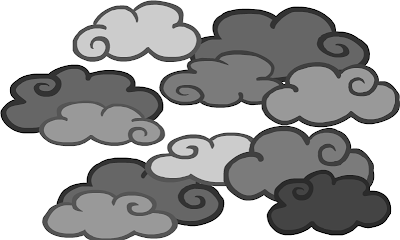
Clouds and Light Rays
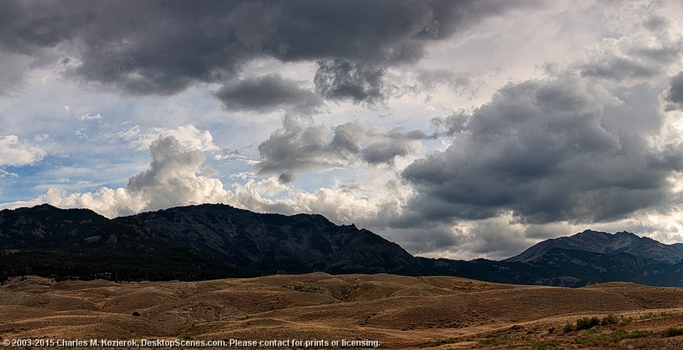
After watching it through a few dozen times, I've decided that my animation would benefit from an opening shot to establish the were abouts of the cave and the characters rather than just plunging straight inside the cave. At the point the audience has no idea there's more than one character, so they have no idea what his motivation is for being inside the cave/trying to obtain the bottle. I think its necessary to show he has friends/family/other people in his tribe waiting outside for him so he has a reason to be there. While thinking of this I realised that such an opening would be the perfect opportunity to push the 'feel good' power further. Yes its lovely that the drink makes the people dance when it showers down on them, but why are they so desperate for it in the first place? The answer should be because they're miserable. They need the power of Feel Good Drinks to make their lives happy again and chase the gloominess away. And what better way to portray misery than storm clouds and grey, overcast skies? And opening shot showing the people miserable as dark clouds overshadow them would starkly contrast against the clear, bright skies at the end of the animation when the bottle flies out, as well as the shining sun rays. I think this would be a really good way to advertise the Feel Good factor and exaggerate the effects of the juice much further. But in order to do this, first I need references.
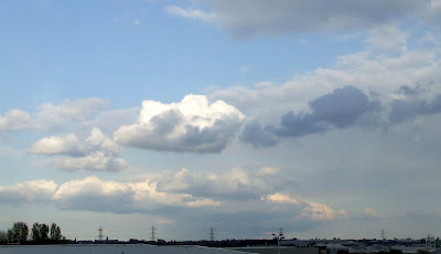
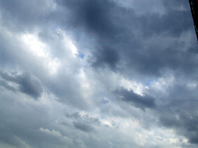
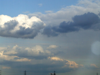
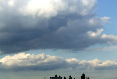
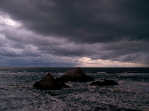
Unfortunately the clouds here haven't been particularly interesting or dramatically stormy over the past few weeks, and if there has been any angelic looking light rays poking through the grey then I certainly haven't seen them. I did try to get some first hand references regardless, which you can see above. One thing I have learned from them is you very rarely seen an overcast cloudy sky where the clouds are all the shade shade of grey. There's always a mix of dark to light even on the stormiest days (as you can see from the Internet references below), with various sizes as well. The images below have all been found online from various sites, some of which are absolutely beautiful and brilliant to refer to.


The above photographs of light rays piercing through clouds have been especially helpful, showing me that the rays always seem to be slanted and never come straight down at 90 degrees. The smaller the gap in the clouds, the narrower, brighter and more concentrated the ray becomes, whereas a larger gap usually allows a wider, but weaker ray to pass through. Though this naturally depends on the intensity of the sunlight behind the clouds.
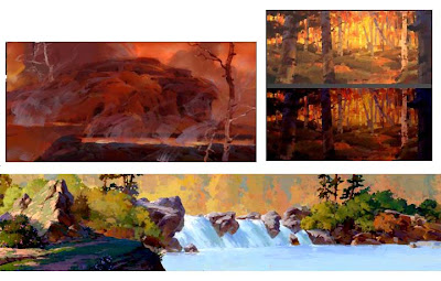
I next started looking at rays clouds and light rays are usually portrayed in animated media, and happened across this opening video to a Japanese visual novel game called 'ef - The Latter Tale'. While I'm aware the video is all anime styled, it is the wonderfully detailed backgrounds I'm looking at, not the characters. The animation showcases some simply stunning cloud and light ray effects, and while I could never hope to achieve something even close to that level of detail (doing so would no fit with the visual style/tone of my animation anyway), watching the way the rays of light are animated in this has given me a better understanding of how they act. It appears the rays can become wider and brighter as the clouds part, but if the clouds part too far then the light can no longer be condensed into rays and they seemingly fade away. I will need to do something similar as I intend to have my clouds part and disappear completely.

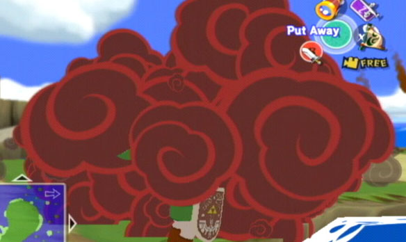
For the clouds themselves I looked at art from cel shaded video games, since they have a tendency to simplify things in a cartoony style that I thought would be useful for drawing my own clouds. Above is some background art from the game Okami which borrows its visual style from traditional Japanese paintings, and below are several pieces of artwork/screenshots from The Legend of Zelda: The Wind Waker which take on an even more exaggerated, 'deformed' style, but still keeps things very simple and cartoony. What I especially like about the art from both of these games is how they use swirls for things like wind, fire, smoke, and clouds. It has a very charming, painterly look that I think would fit well with the style of my animation.


For my own clouds (which you can see below) I decided to incorporate the swirliness of The Wind Waker smoke but not to the same extent. I think too much swirliness would just make them look silly; they are supposed to be threatening storm clouds after all. But at the same time they look too plain and boring without the swirl, so I think just having one on each cloud works nicely. I made sure to make several of each different shade of grey and mix them accordingly to give an uneven overcast like the real clouds in the photos, and I mixed up the clouds on each to give the impression of more depth. I intend to animate each layer of clouds moving at a slightly different speed which will also add to this.
Below are screen prints of the light rays I added peaking out the clouds. I decided not to go overboard with them since the sun already has tons of bright rays moving round it in the background and I felt too many shining through the cloud would just be overkill. As they are, I think four small-ish ones work quite well, especially considering the angle of the camera looking up at the sun. As the clouds part I shape tweened the rays to grow larger and then fade away as the cloud leave completely.
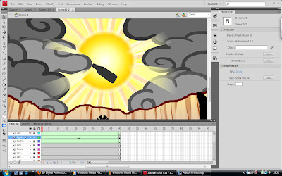
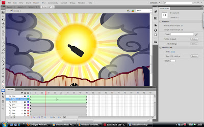
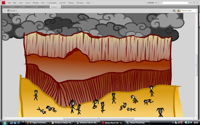
Last but not least, here is the opening scene with the stormy sky. I decided to keep it a static shot (apart from the clouds moving in the background) since the people are too tiny to animate properly, plus if they're all sitting/laying around miserable then I doubt they would be moving very much anyway. This way I can draw a lot of them in dejected positions; I've tried to show most of them either sitting, laying, or kneeling down, though that was a little difficult with such small stick men... Hopefully it works well enough to get the idea across, and a thundery sound effect to accompany the dark clouds will help set the mood.


Unfortunately the clouds here haven't been particularly interesting or dramatically stormy over the past few weeks, and if there has been any angelic looking light rays poking through the grey then I certainly haven't seen them. I did try to get some first hand references regardless, which you can see above. One thing I have learned from them is you very rarely seen an overcast cloudy sky where the clouds are all the shade shade of grey. There's always a mix of dark to light even on the stormiest days (as you can see from the Internet references below), with various sizes as well. The images below have all been found online from various sites, some of which are absolutely beautiful and brilliant to refer to.


The above photographs of light rays piercing through clouds have been especially helpful, showing me that the rays always seem to be slanted and never come straight down at 90 degrees. The smaller the gap in the clouds, the narrower, brighter and more concentrated the ray becomes, whereas a larger gap usually allows a wider, but weaker ray to pass through. Though this naturally depends on the intensity of the sunlight behind the clouds.
I next started looking at rays clouds and light rays are usually portrayed in animated media, and happened across this opening video to a Japanese visual novel game called 'ef - The Latter Tale'. While I'm aware the video is all anime styled, it is the wonderfully detailed backgrounds I'm looking at, not the characters. The animation showcases some simply stunning cloud and light ray effects, and while I could never hope to achieve something even close to that level of detail (doing so would no fit with the visual style/tone of my animation anyway), watching the way the rays of light are animated in this has given me a better understanding of how they act. It appears the rays can become wider and brighter as the clouds part, but if the clouds part too far then the light can no longer be condensed into rays and they seemingly fade away. I will need to do something similar as I intend to have my clouds part and disappear completely.

For the clouds themselves I looked at art from cel shaded video games, since they have a tendency to simplify things in a cartoony style that I thought would be useful for drawing my own clouds. Above is some background art from the game Okami which borrows its visual style from traditional Japanese paintings, and below are several pieces of artwork/screenshots from The Legend of Zelda: The Wind Waker which take on an even more exaggerated, 'deformed' style, but still keeps things very simple and cartoony. What I especially like about the art from both of these games is how they use swirls for things like wind, fire, smoke, and clouds. It has a very charming, painterly look that I think would fit well with the style of my animation.


For my own clouds (which you can see below) I decided to incorporate the swirliness of The Wind Waker smoke but not to the same extent. I think too much swirliness would just make them look silly; they are supposed to be threatening storm clouds after all. But at the same time they look too plain and boring without the swirl, so I think just having one on each cloud works nicely. I made sure to make several of each different shade of grey and mix them accordingly to give an uneven overcast like the real clouds in the photos, and I mixed up the clouds on each to give the impression of more depth. I intend to animate each layer of clouds moving at a slightly different speed which will also add to this.

Below are screen prints of the light rays I added peaking out the clouds. I decided not to go overboard with them since the sun already has tons of bright rays moving round it in the background and I felt too many shining through the cloud would just be overkill. As they are, I think four small-ish ones work quite well, especially considering the angle of the camera looking up at the sun. As the clouds part I shape tweened the rays to grow larger and then fade away as the cloud leave completely.


Last but not least, here is the opening scene with the stormy sky. I decided to keep it a static shot (apart from the clouds moving in the background) since the people are too tiny to animate properly, plus if they're all sitting/laying around miserable then I doubt they would be moving very much anyway. This way I can draw a lot of them in dejected positions; I've tried to show most of them either sitting, laying, or kneeling down, though that was a little difficult with such small stick men... Hopefully it works well enough to get the idea across, and a thundery sound effect to accompany the dark clouds will help set the mood.

Background Detail
Another thing that was brought to my attention about the deign of my animation was that some of the scenes lacked detail. While I think its necessary to keep the backgrounds reasonably minimalistic so as not to lose the character (my past experiments have shown that messy, complicated backgrounds make it difficult for the eye to track a simplistic stick man), I do agree that some scenes look far too sparse... Mostly because I was rushing at the time and didn't get round to adding any more detail. The main culprit seems to be the rock/cliff outside which up until now was coloured using only a simple brown gradient, making it all seem very flat and bland. With this in mind, I have done further researched into cave art and found some examples of how rocks, stone, and cliffs are portrayed effectively in other animated media.

Concept art from the game Okami. The sides of the cliff are accented using dark lines and rough shading.
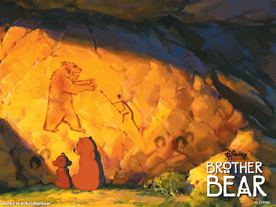
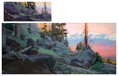
Concept art from the Disney film, Brother Bear. More rough, painterly shading in blotches to show the uneven surface of the rocks.
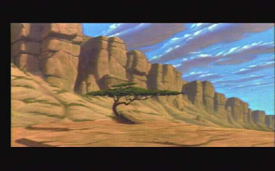
Background art of the gorge from The Lion King.
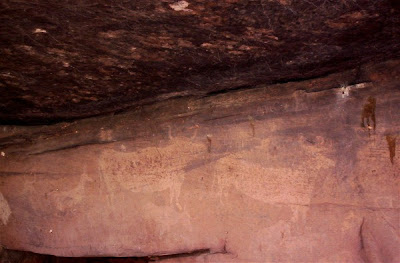
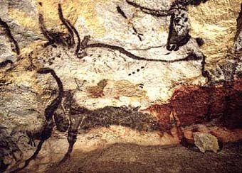
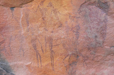
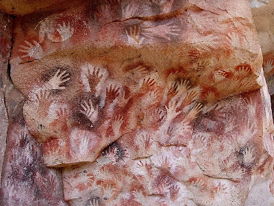
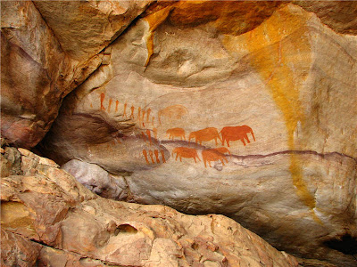
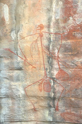
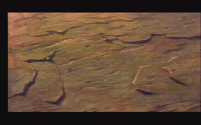
Photos from various caves around the world.
After studying the above images I decided to separate the two most common methods of rock detailing (jagged dark lines and rough shading): I used long, fairly straight dark lines to hatch the under side of the cliff, making it appear a lot more shadowy and possibly giving it some much needed perspective. I then quickly hatched the upper wall of the cliff using many different opacities of the same shade of brown so they all overlapped each other, and used a small eraser to quickly and randomly rub out vertical-ish lines to let some of the original gradient shine through underneath. I think the result looks pretty good, as the cliff now has multiple tones and appears to have both light and dark crevices all over. While its not a great deal of change, I think this amount of detail is enough to easily differentiate the levels of rock on the cliff while making it look more interesting to look at as a whole. Any more detail would risk the characters being lost in the confusion, especially with so much else going on.

Concept art from the game Okami. The sides of the cliff are accented using dark lines and rough shading.


Concept art from the Disney film, Brother Bear. More rough, painterly shading in blotches to show the uneven surface of the rocks.


Background art of the gorge from The Lion King.


Photos from various caves around the world.

After studying the above images I decided to separate the two most common methods of rock detailing (jagged dark lines and rough shading): I used long, fairly straight dark lines to hatch the under side of the cliff, making it appear a lot more shadowy and possibly giving it some much needed perspective. I then quickly hatched the upper wall of the cliff using many different opacities of the same shade of brown so they all overlapped each other, and used a small eraser to quickly and randomly rub out vertical-ish lines to let some of the original gradient shine through underneath. I think the result looks pretty good, as the cliff now has multiple tones and appears to have both light and dark crevices all over. While its not a great deal of change, I think this amount of detail is enough to easily differentiate the levels of rock on the cliff while making it look more interesting to look at as a whole. Any more detail would risk the characters being lost in the confusion, especially with so much else going on.
Revised Dancer

When I went back to my dancer to improve her spinning, I discovered that I had somehow well and truly made a mess of her. I don't know how sleep deprived I was when I originally animated this, but the upon closer inspection of each frame its clear I wasn't focusing properly. In order to show the differences between the original and the revised version (as they are rather subtle) I have pasted each individual drawing next to each other, and as you can see above, she somehow swaps the leg she's standing on in the fourth and fifth drawings and then swaps back again. It seems I managed to get away with this last time due to the stick-man/silhouette nature of the characters, as it can be difficult for the eyes to distinguish which limbs are in front and which are behind when they move quickly. But the fact remains that this was a glaring error on my part which needed to fixed, and that is exactly what I have done.

First I fixed the drawings where the legs were opposite of what they should be, then I altered a second set of the original ten frames so the alternative leg is in front, thus allowing the girl to change the leg she's spinning on after one twirl. I made sure to vary some of the poses in the second set so they weren't identical to the first; making it easier for the eye to read the difference in the movement and define which leg is in front and which is behind (advice often given by Richard Williams in The Animator's Survival Kit). I changed the eighth and ninth frames in each set to make it look like she's putting the leg currently in the air down while hopping up with the other one (and so changing legs). Lastly I positioned the tenth frame of the first set slightly to the left (and all the frames following it in the second set), and the tenth frame of the second set slightly to the right (so it falls back in line with the first frame of the first set when it loops), again to help the eye follow the slight change in action when the legs switch. Plus it is unlikely that anyone spinning at a fast speed will hop into exactly the same spot when they change legs.
Admittedly even now you can't see a great deal of difference between this and the original version due to how fast she spins, but I still think it looks a little better than my first attempt and I'm glad I went back to fix it. If she was larger I think the error would have been a lot more obvious. I've decided to keep just the two of them (the dancer and the guy waving his arms) in the full scene simply because they fill the space quite nicely as they are. I tried drawing a third person into the background of one frame but it just looked too crowded, and the third person was lost amidst the action of the other two, so I think I will leave it as it is for now.
Reach for the Sky
Revised version of the static scene I made previously. I animated one pair of hands opening frame-by-frame, then copy and pasted the hands onto the other two people int he scene, resizing them accordingly. I made sure to have them open their hands at different times and overlap each other to make it seem more realistic; after all, everyone has different reaction times. If it was a real crowd of people, everyone wouldn't raise their hands at exactly the same time in perfect unison. I think it looks a lot better this way and the action negates the need for the 'ease-in' zoom affect which I had on the scene before.
Grabbing the Bottle
My initial inspiration for this scene came from the Disney film Aladdin, when Aladdin goes to grab the lamp from its resting place in the Cave of Wonders. I really like how he slowly approaches the lamp almost apprehensively, holding his arms out as both hands slowly cup around the lamp rather than just picking it up immediately with one hand. It really gives the sense that the lamp is a precious and mystical object which should be handled carefully, and I wanted to imitate this body acting in my own animation since the character I'm working with doesn't have facial expressions, thus making it difficult to show the hesitant wonder he should be feeling upon seeing the bottle before him. Below I've posted a video showing the Aladdin clip in question(please forgive the sound, this was the shortest clip I could find) which I have used as a reference.
I also felt I needed to act the movement out myself to properly understand how the character's hands and arms should move, so I once again got someone to film myself attempting it which you can see below. I found the exercise particularly useful for figuring out how to position the back arm so it could be clearly seen despite the silhouette nature of the character. It also helped to see my back curving as I bent down slightly to pick up the bottle, something I realised I could exaggerate while animating to make the movement clearer.
My attempt at the movement was tricky to get right, mostly due to me wanting to give the impression of the camera moving around the character as he went to pick up the bottle. Naturally this would be easy to do with a 3D model, but I found it difficult to draw the character at the correct angles frame-by-frame to make the movement (both of him and the 'camera') look smooth and convincing, especially since he has no features to show the difference between the side and the front of his body. And again, there was also the problem of keeping him limbs clearly distinguished from his body at the awkward angles. I achieved the outcome first by key framing the action(effectively splitting the movement into three parts: turning from front view to profile, bending down to put his hands around the bottle, and lastly picking up the bottle) and then by filling the in betweens through a lot of trial and error, but I have to say I'm quite pleased with how its turned out. The only problem is that the action is far too fast since I've been working in ones rather than twos, so I intend to go back and try slowing things down.
Here is the same scene again but with most of the drawings held for two frames, slowing down the movement up until he grabs the bottle. I left the last few drawings as he brings the bottle up to his face on one frame each simply because having them on twos looked too slow. The slow movement works perfectly for the build up to him putting his hands around the bottle, but once the bottle is in his hands I want to show his excitement by having him pull it up quite quickly after an initial pause. He's finally got his hands on this wondrous sacred artifact, or course he's going to be excited! The idea is he's so exhilarated by his find that he throws it into the air in celebration (hence the dropping of the bottle and the rest of the story that follows), so it makes a lot more sense for the final few frames of this scene to play faster to show this. I also made sure to curve his back towards the bottle as he picked it up to give the impression of his chest being pushed forward and his shoulders being pushed back, as I noticed myself doing that as I pushed my hips forward slightly in the video reference I made. Obviously his hips aren't shown in this shot, but the action can still be implied by the movement of the upper body, and its the little details like that which make the finishing pose look convincing. Pushing your hip/stomach forward as you hold something to your chest gives the impression that you want to hug that something close because its dear to you, and the bottle is clearly supposed to be important to the character. Overall I'm pleased with the timing and general feel of the movement; at the moment it looks more like he's turning to the side rather than the camera's moving round him, but that'll change once I have the background moving round behind him as well.
Before starting on the backgrounds I scaled up every frame to the correct size for the scene so I can how everything should be placed in relation to the character and the bottle. Below is the re-size test.
I began by drawing the background for the first and final frames in the scene so they could act as key frames for me to fill in between. At first I thought I might be able to get away with just using the transform tool to skew/distort the first background slightly for the second and third background frames, but it soon came apparent through the test below that that would look awful. Not to mention that the background needs to move around a lot faster than that.
Backgrounds for each frame are now fully drawn (again, a lot of trail and error) and held for two frames each to match the movement of the character. I think it works quite well; its more obvious now that its the camera moving round rather then character himself turning int he spot. But I can't help but feel the sweeping movement of the background is a little too... jerky. I might try adding extra frames and having the background play on ones rather than twos to see if it improves it any.
After adding the extra background frames I think the sweeping movement works a lot better... its a lot smoother and appear quicker now, which I like. I think I'll keep it this way. However doing this has made me notice that the lines of the cave wall move in the wrong direction (right instead of left), which is probably what made the previous test look rather jarring. I'll fix that next.
Final version of the scene with the wall lines fixed and the light added. While I know I could push this a lot further by exaggerating the character's actions and slowing him down even more, I feel this could ruin the flow of the animation as a whole. I need to keep in mind that this is being made for a TV advert that will only get to fun for about 30-40 seconds, so I can't afford to drag things out too much or I'll never fit everything in without rushing it. For now I think this will fit well with the scenes I already have.
3 Weeks To Go
For the final stretch of this module we've been given the option of either creating an entirely new brief of our own (which doesn't seem wise considering we only have three weeks to complete whatever project this may be), or to complete/continue our previous live brief project. I enjoyed working of the Feel Good Drinks brief and regret not being able to finish it off properly in the time I had, so I've decided to complete it to the best of my ability in the extra time we've been given. I'd like to get the project to a stage where I feel I can show it to people as a serious competition entry (even though the deadline for said competition has long since passed), so it comes across as a possibility for a real advertisement.
I intend to go go back and add the main scene I had to leave out last time where the character goes to grab the bottle, as well as tweak some other scenes which look rather lazy and static. One of these is the scene where the other people are shown stretching the hands skyward in an attempt to catch the falling bottle; panning over a still image of this looked really bad in the 'final' animation and I didn't like it at all. I'll animate them to show their hands reaching upwards, and while I'm at it I'll fix the dancing/twirling girl so she's not permanently (and unrealistically) spinning on one leg. Its also been brought to my attention how unprofessional the sign in the shrine looks with my wobbly hand written text, so I'm going to look into the fonts used in relation to the Feel Good products to see which would be the most appropriate to use instead. Lastly, and perhaps most importantly, I'm going to look into sound so my advert can finally have a music track of some sort, or at the very least some background sound effects. I feel this is necessary to make the animation feel finished, as it isn't very effective in grabbing people's attention (which is exactly what adverts are made for) while silent.
I intend to go go back and add the main scene I had to leave out last time where the character goes to grab the bottle, as well as tweak some other scenes which look rather lazy and static. One of these is the scene where the other people are shown stretching the hands skyward in an attempt to catch the falling bottle; panning over a still image of this looked really bad in the 'final' animation and I didn't like it at all. I'll animate them to show their hands reaching upwards, and while I'm at it I'll fix the dancing/twirling girl so she's not permanently (and unrealistically) spinning on one leg. Its also been brought to my attention how unprofessional the sign in the shrine looks with my wobbly hand written text, so I'm going to look into the fonts used in relation to the Feel Good products to see which would be the most appropriate to use instead. Lastly, and perhaps most importantly, I'm going to look into sound so my advert can finally have a music track of some sort, or at the very least some background sound effects. I feel this is necessary to make the animation feel finished, as it isn't very effective in grabbing people's attention (which is exactly what adverts are made for) while silent.
Thursday, 25 March 2010
Final FeelGood Animation
Here is the final animation, or as final as I could get it before the deadline. In the end I had to cut out two of scenes I had originally planned in my storyboard, one of which (when the character first approaches and picks up the bottle in the cave) I really wanted to keep in... I don't think the story suffers too much without it, but it jumps a little too quickly to be comfortable and I think it would be a lot clearer if I'd had time to animate that scene. Perhaps I'll go back and add it in another time.
Dancing in the FeelGoodness
For the second to last scene when the people below are showed in Feel Good Juice and rejoice, I wanted to have at least one of the characters doing some kind of dance or twirl in the juice to imitate my favourite photograph from the Feel Good Drinks blog. After all, what better way to show you're feeling good than to dance? Naturally for this I had to get the video camera out again, since I had no idea where to start with making a spin look convncing.
I'll admit, these references where fun to act out... Also brilliantly helpful for getting the basic poses and spine curves inbedded in my mind. While my attempts at twirls were far from the best, from them I was able to exaggerate the poses much further.
Here's the test I did for the twirling character. She was difficult to get right, especially her speed... I tried to add perspective to her hands so they appeared larger when the front hand passed by/was reaching out to the camera and smaller when the back hand was stretched away from the screen. All in all I like how it turned out and I think I managed to make it loop reasonably well. If I had more time I'd have liked to make her spin from foot to foot so her continuous twirling made more sense, but unfortuntely I'll have to leave this for now if I want to finish on time.
This is the final scene with another character waving his arms (hopefully happily?) in the air as he basks in the juicy goodness. As you can see from the storyboard, I originally intended to have three characters doing something in this scene, but the dancer took far longer to animate than I first thought, as did the juice droplets raining down from the sky. Hopefully it doesn't look too empy with just two...
Juice Pouring
When it came to animating the juice bursting out the bottle, I had no idea where to start. I've never animated flowing water before and I found the task even more difficult than I first anticipated during my first attempt, so I tried recording someone opening a bottle of fizzy drink to help me get a better idea. The video itself isn't the most helpful since I want my juice to be very over-exaggerated when it bursts/pours out the bottle, and I've planned to draw the scene from an angle which showers the 'camera' in juice, something that I can't really replicate in real life. It was useful, however, for the smaller trickle of juice that pours out after the intiial outburst which you can see at the end.
My first attempt went horrible wrong. The 'juice' looks more like goo or jelly because of the gloopy curved edges and I think it flows too slowly...
My second attempt went much better, looking more like actual liquid now rather than gloop. My onlu problem was that it didn't seem exaggerated enough at the initial burst, especially not from the starting perspective...
My final version turned out much better than I expected it to; I adjusted the initial juice burst and added smaller droplets/spray at the start since liquid never pours out perfects when its container is suddenly turned upside down from a great height. I also added semi-transparent light reflections on the juice to show how high in the sky/close to the sun the bottle is at that point. I think the highlights also help enhance the flowing/pouring motion. I know its still not perfect, but for my first time at animating liquid of any kind I'm quite pleased with it, and I can always go back and add to it if I have time. For now I need to concentrate on my other scenes.
Lunge
Above is the reference I used for the lunge scene, which I acted out myself several times before and during my attempt to animate it. Trying the action out for myself was very helpful in this case since it showed me that after the extreme stretching point, there is a slight recoil as the hand, arm, and body jerk back a little to regain balance as the heel goes down. This was something I hadn't fully considered before, so I was then able to add it into the animation which made the movement look much more realistic. I then exaggerated it further, making the extreme stretch pose stretch a little further than I'd originally intended, and made it hold a fraction longer for emphasis. I also took time to add follow-through animation to the hair since hair always has to catch to the body.
Stairs
At first I thought I'd just have the bottle roll in from one side of the frame and out the other, but after making this initial test I realised the clip would be over to soon and wouldn't give the impression of the bottle rolling quickly down many stairs - too quickly for the character to catch. I also had trouble figuring out how to make it look like it was rolling convincingly without completely destroying the Feel Good logo. In the end I decided to leave the scene a while and observe how the real bottle would roll down a flight of stairs, which you can see below.
Unfortunately my stairs at the time where too steep to get a useful reference, but watching the bottle bounce a little from the higher steps gave me the idea of adding more squash and stretch to the animation. Naturally the bottle can squash and stretch too much since its actually quick sturdy and stiff, especially when filled with juice, and I didn't want to give th eimpression of the bottle being flimsy. But at the same time, I think the bit of squash and stretch I did add has improved the animation as a whole and made the bottle look more like its falling and hitting each step. I kept the bottle in the center of the frame for the final version and instead moved the steps along behind it, allowing me to loop the animation for as long as I want to give the impression of constant rolling down stairs.
Losing Balance
I started off trying to animate the action of the guy losing his balance a turning to run after the dropped bottle purely by imagining it in my head, which made things very difficult. I just couldn't picture the movement correctly and struggled to draw each pose convincingly, as you can see in the short test below.
I soon gave up on this method, having realised I could get no further without acting the movement out myself. After practising it a few times I got a good idea of how his legs and spine should bend, as well as discovering that his hands should face a completely different direction than I originally imagined when turning around.I asked a friend to video me as well so I could look back and use myself as a reference.
This made animating much easier and more enjoyable, and I think the finished result turned out well. I exaggerated the movement so it would be clearer to follow, giving him a longer, springier step than my own, so it appears he's almost jumping from his back leg to his front rather than just stepping/transferring his weight. I like how this looks as I think it make him appear more urgent and panicked, as well as energetic and desperate to retrieve the bottle.
Obtaining the Bottle
Since I planned for the scene where the guy raises the bottle over his head in triumph to be reminiscent of a video game, I realised I could push the push the mockery much further and have more fun with it than just simply having the bottle hover over his head in a 'new item obtained' kind of way. I thought it would be a lot more amusing if the character threw the bottle up into the air in excitement, only to get carried away and throw it too far, so it falls behind him and rolls away. For this I needed video footage of how hands looks when thrusting directly into the camera, as I can't picture such an extreme perspective accurately enough in my head to make it work alone. Below are the two references I used for animating this scene.
In the end I tried to exaggerate the perspective even more by starting with he camera zoomed right in on his hands clutching the bottle, then quickly zooming out as he throws his hands into the air. I really like how it turned out, as painful as it was to make it look right.
In the end I tried to exaggerate the perspective even more by starting with he camera zoomed right in on his hands clutching the bottle, then quickly zooming out as he throws his hands into the air. I really like how it turned out, as painful as it was to make it look right.
Background Experiments
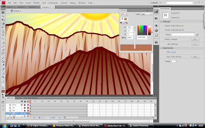
Getting the background and general style of the animation to look right was tricky... Deciding I wanted the character to look hand drawn and slightly cave drawing-like was simple enough, but when I tried colouring the inside of the cave in a similarly loose, messy style (I intentionally made it scribbly to try to better convey the 'hand drawn' aspect), it didn't really work... The background looks far too chaotic and distracts from the character and the action. Plus its difficult to tell you're looking at the back of the guy's head when he has no facial features to distinguish front from back... Perhaps filling the entire head with a darker grey rather than just a scribble would help.
After a while I decided to go with a more minimalistic approach and settled for pale gradient fills with bold edges in darker colours to set them off. I think this works much better and comes across as a lot lighter and more cheerful, which is what the general fell of Feel Good Drinks is supposed to be all about. The last version was far too heavy and moody, so I'm glad I changed it. I also added an extra gradient layer to the water to make the colour fade out towards the edges, thus allowing the stone walls to show underneath the water's surface slightly. I really like this transparency effect as I think it makes the water look more like real liquid rather than just a blue solid floor.

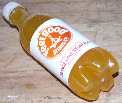
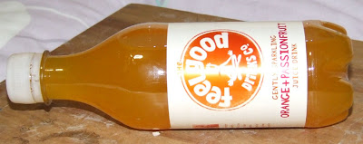
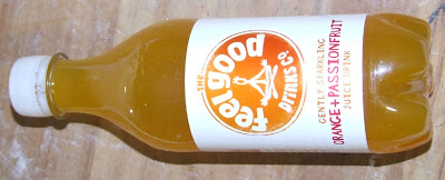
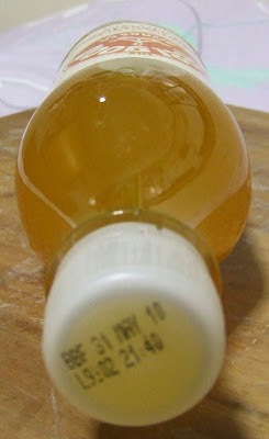
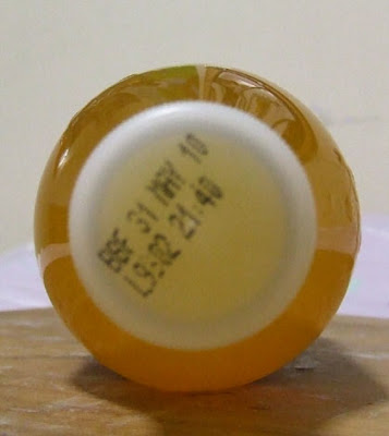
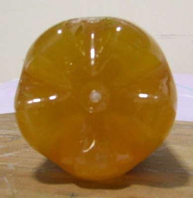
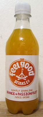
FeelGood Photos!
I finally found somewhere that sells Feel Good drinks! To celebrate, I bought a few bottles (one to try for myself, one for photographing, and one spare) and took some close up photos of the product itself to use as reference material. I tried to take the photos from the angles I've depicted in my storyboard so I can edit and use them in the animation later on rather than trying to create my own Feel Good bottle from scratch. I think this method will be much more effective at advertising the product since it will be recognisable as the real thing rather than just a simplified cartoony version I've made myself. The only trouble will be getting the photos to fit in with the flat, Flash graphics... I'll have to experiment with some of the filters in Photoshop to see what I can come up with.
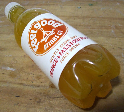
It took a while, but eventually I discovered that the 'Cut Out' filter in Photoshop works really well as a way to flatten the photos into cartoony block colours without too much shading. I had to edit them manually afterwards to enhance the colours and clean the bottles up a bit, but other than that i think they've turned out quite well! They seem to fit better in with the style of animation I've chosen. For now I've only edited the two photos I think I'm most likely to need, but I'll go back and do more when/if necessary.
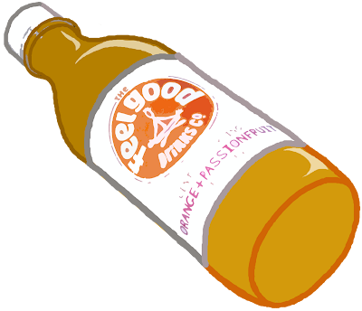
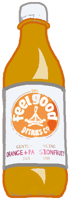


It took a while, but eventually I discovered that the 'Cut Out' filter in Photoshop works really well as a way to flatten the photos into cartoony block colours without too much shading. I had to edit them manually afterwards to enhance the colours and clean the bottles up a bit, but other than that i think they've turned out quite well! They seem to fit better in with the style of animation I've chosen. For now I've only edited the two photos I think I'm most likely to need, but I'll go back and do more when/if necessary.


Subscribe to:
Posts (Atom)