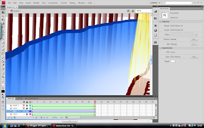
Getting the background and general style of the animation to look right was tricky... Deciding I wanted the character to look hand drawn and slightly cave drawing-like was simple enough, but when I tried colouring the inside of the cave in a similarly loose, messy style (I intentionally made it scribbly to try to better convey the 'hand drawn' aspect), it didn't really work... The background looks far too chaotic and distracts from the character and the action. Plus its difficult to tell you're looking at the back of the guy's head when he has no facial features to distinguish front from back... Perhaps filling the entire head with a darker grey rather than just a scribble would help.
After a while I decided to go with a more minimalistic approach and settled for pale gradient fills with bold edges in darker colours to set them off. I think this works much better and comes across as a lot lighter and more cheerful, which is what the general fell of Feel Good Drinks is supposed to be all about. The last version was far too heavy and moody, so I'm glad I changed it. I also added an extra gradient layer to the water to make the colour fade out towards the edges, thus allowing the stone walls to show underneath the water's surface slightly. I really like this transparency effect as I think it makes the water look more like real liquid rather than just a blue solid floor.

No comments:
Post a Comment