Thursday, 25 March 2010
Final FeelGood Animation
Here is the final animation, or as final as I could get it before the deadline. In the end I had to cut out two of scenes I had originally planned in my storyboard, one of which (when the character first approaches and picks up the bottle in the cave) I really wanted to keep in... I don't think the story suffers too much without it, but it jumps a little too quickly to be comfortable and I think it would be a lot clearer if I'd had time to animate that scene. Perhaps I'll go back and add it in another time.
Dancing in the FeelGoodness
For the second to last scene when the people below are showed in Feel Good Juice and rejoice, I wanted to have at least one of the characters doing some kind of dance or twirl in the juice to imitate my favourite photograph from the Feel Good Drinks blog. After all, what better way to show you're feeling good than to dance? Naturally for this I had to get the video camera out again, since I had no idea where to start with making a spin look convncing.
I'll admit, these references where fun to act out... Also brilliantly helpful for getting the basic poses and spine curves inbedded in my mind. While my attempts at twirls were far from the best, from them I was able to exaggerate the poses much further.
Here's the test I did for the twirling character. She was difficult to get right, especially her speed... I tried to add perspective to her hands so they appeared larger when the front hand passed by/was reaching out to the camera and smaller when the back hand was stretched away from the screen. All in all I like how it turned out and I think I managed to make it loop reasonably well. If I had more time I'd have liked to make her spin from foot to foot so her continuous twirling made more sense, but unfortuntely I'll have to leave this for now if I want to finish on time.
This is the final scene with another character waving his arms (hopefully happily?) in the air as he basks in the juicy goodness. As you can see from the storyboard, I originally intended to have three characters doing something in this scene, but the dancer took far longer to animate than I first thought, as did the juice droplets raining down from the sky. Hopefully it doesn't look too empy with just two...
Juice Pouring
When it came to animating the juice bursting out the bottle, I had no idea where to start. I've never animated flowing water before and I found the task even more difficult than I first anticipated during my first attempt, so I tried recording someone opening a bottle of fizzy drink to help me get a better idea. The video itself isn't the most helpful since I want my juice to be very over-exaggerated when it bursts/pours out the bottle, and I've planned to draw the scene from an angle which showers the 'camera' in juice, something that I can't really replicate in real life. It was useful, however, for the smaller trickle of juice that pours out after the intiial outburst which you can see at the end.
My first attempt went horrible wrong. The 'juice' looks more like goo or jelly because of the gloopy curved edges and I think it flows too slowly...
My second attempt went much better, looking more like actual liquid now rather than gloop. My onlu problem was that it didn't seem exaggerated enough at the initial burst, especially not from the starting perspective...
My final version turned out much better than I expected it to; I adjusted the initial juice burst and added smaller droplets/spray at the start since liquid never pours out perfects when its container is suddenly turned upside down from a great height. I also added semi-transparent light reflections on the juice to show how high in the sky/close to the sun the bottle is at that point. I think the highlights also help enhance the flowing/pouring motion. I know its still not perfect, but for my first time at animating liquid of any kind I'm quite pleased with it, and I can always go back and add to it if I have time. For now I need to concentrate on my other scenes.
Lunge
Above is the reference I used for the lunge scene, which I acted out myself several times before and during my attempt to animate it. Trying the action out for myself was very helpful in this case since it showed me that after the extreme stretching point, there is a slight recoil as the hand, arm, and body jerk back a little to regain balance as the heel goes down. This was something I hadn't fully considered before, so I was then able to add it into the animation which made the movement look much more realistic. I then exaggerated it further, making the extreme stretch pose stretch a little further than I'd originally intended, and made it hold a fraction longer for emphasis. I also took time to add follow-through animation to the hair since hair always has to catch to the body.
Stairs
At first I thought I'd just have the bottle roll in from one side of the frame and out the other, but after making this initial test I realised the clip would be over to soon and wouldn't give the impression of the bottle rolling quickly down many stairs - too quickly for the character to catch. I also had trouble figuring out how to make it look like it was rolling convincingly without completely destroying the Feel Good logo. In the end I decided to leave the scene a while and observe how the real bottle would roll down a flight of stairs, which you can see below.
Unfortunately my stairs at the time where too steep to get a useful reference, but watching the bottle bounce a little from the higher steps gave me the idea of adding more squash and stretch to the animation. Naturally the bottle can squash and stretch too much since its actually quick sturdy and stiff, especially when filled with juice, and I didn't want to give th eimpression of the bottle being flimsy. But at the same time, I think the bit of squash and stretch I did add has improved the animation as a whole and made the bottle look more like its falling and hitting each step. I kept the bottle in the center of the frame for the final version and instead moved the steps along behind it, allowing me to loop the animation for as long as I want to give the impression of constant rolling down stairs.
Losing Balance
I started off trying to animate the action of the guy losing his balance a turning to run after the dropped bottle purely by imagining it in my head, which made things very difficult. I just couldn't picture the movement correctly and struggled to draw each pose convincingly, as you can see in the short test below.
I soon gave up on this method, having realised I could get no further without acting the movement out myself. After practising it a few times I got a good idea of how his legs and spine should bend, as well as discovering that his hands should face a completely different direction than I originally imagined when turning around.I asked a friend to video me as well so I could look back and use myself as a reference.
This made animating much easier and more enjoyable, and I think the finished result turned out well. I exaggerated the movement so it would be clearer to follow, giving him a longer, springier step than my own, so it appears he's almost jumping from his back leg to his front rather than just stepping/transferring his weight. I like how this looks as I think it make him appear more urgent and panicked, as well as energetic and desperate to retrieve the bottle.
Obtaining the Bottle
Since I planned for the scene where the guy raises the bottle over his head in triumph to be reminiscent of a video game, I realised I could push the push the mockery much further and have more fun with it than just simply having the bottle hover over his head in a 'new item obtained' kind of way. I thought it would be a lot more amusing if the character threw the bottle up into the air in excitement, only to get carried away and throw it too far, so it falls behind him and rolls away. For this I needed video footage of how hands looks when thrusting directly into the camera, as I can't picture such an extreme perspective accurately enough in my head to make it work alone. Below are the two references I used for animating this scene.
In the end I tried to exaggerate the perspective even more by starting with he camera zoomed right in on his hands clutching the bottle, then quickly zooming out as he throws his hands into the air. I really like how it turned out, as painful as it was to make it look right.
In the end I tried to exaggerate the perspective even more by starting with he camera zoomed right in on his hands clutching the bottle, then quickly zooming out as he throws his hands into the air. I really like how it turned out, as painful as it was to make it look right.
Background Experiments
Getting the background and general style of the animation to look right was tricky... Deciding I wanted the character to look hand drawn and slightly cave drawing-like was simple enough, but when I tried colouring the inside of the cave in a similarly loose, messy style (I intentionally made it scribbly to try to better convey the 'hand drawn' aspect), it didn't really work... The background looks far too chaotic and distracts from the character and the action. Plus its difficult to tell you're looking at the back of the guy's head when he has no facial features to distinguish front from back... Perhaps filling the entire head with a darker grey rather than just a scribble would help.
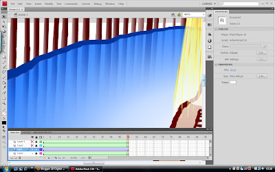
After a while I decided to go with a more minimalistic approach and settled for pale gradient fills with bold edges in darker colours to set them off. I think this works much better and comes across as a lot lighter and more cheerful, which is what the general fell of Feel Good Drinks is supposed to be all about. The last version was far too heavy and moody, so I'm glad I changed it. I also added an extra gradient layer to the water to make the colour fade out towards the edges, thus allowing the stone walls to show underneath the water's surface slightly. I really like this transparency effect as I think it makes the water look more like real liquid rather than just a blue solid floor.
FeelGood Photos!
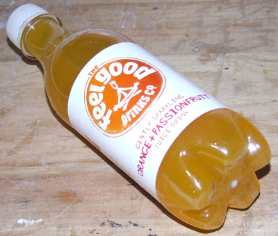
I finally found somewhere that sells Feel Good drinks! To celebrate, I bought a few bottles (one to try for myself, one for photographing, and one spare) and took some close up photos of the product itself to use as reference material. I tried to take the photos from the angles I've depicted in my storyboard so I can edit and use them in the animation later on rather than trying to create my own Feel Good bottle from scratch. I think this method will be much more effective at advertising the product since it will be recognisable as the real thing rather than just a simplified cartoony version I've made myself. The only trouble will be getting the photos to fit in with the flat, Flash graphics... I'll have to experiment with some of the filters in Photoshop to see what I can come up with.
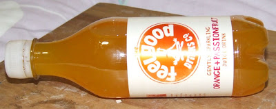
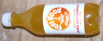
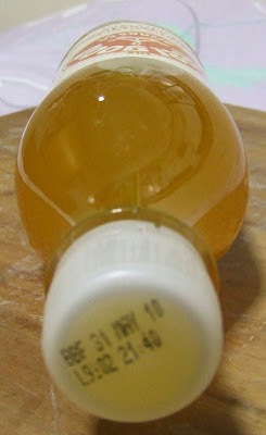
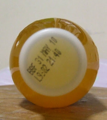
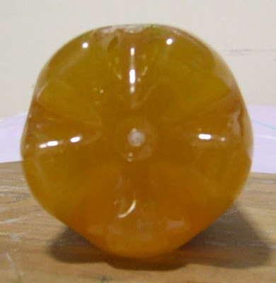
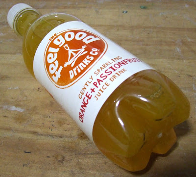
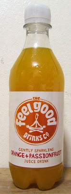
It took a while, but eventually I discovered that the 'Cut Out' filter in Photoshop works really well as a way to flatten the photos into cartoony block colours without too much shading. I had to edit them manually afterwards to enhance the colours and clean the bottles up a bit, but other than that i think they've turned out quite well! They seem to fit better in with the style of animation I've chosen. For now I've only edited the two photos I think I'm most likely to need, but I'll go back and do more when/if necessary.
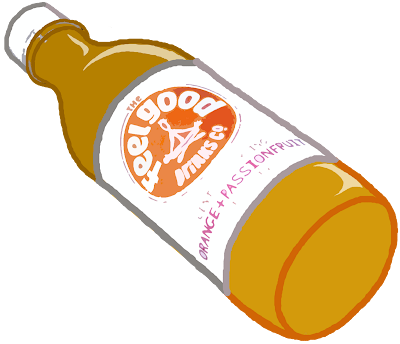
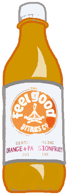


It took a while, but eventually I discovered that the 'Cut Out' filter in Photoshop works really well as a way to flatten the photos into cartoony block colours without too much shading. I had to edit them manually afterwards to enhance the colours and clean the bottles up a bit, but other than that i think they've turned out quite well! They seem to fit better in with the style of animation I've chosen. For now I've only edited the two photos I think I'm most likely to need, but I'll go back and do more when/if necessary.


Monday, 1 March 2010
First Character Animation Test

Due to the Feel Good character being a black silhouette, I fear it will sometimes be difficult to read his actions despite my attempt to separate overlapping body parts with eraser strokes. So to start with I tried animating a run cycle using the above reference from The Animator's Survival Kit, just to get used to the way the character moves.
For my first attempt I recycled the first five frames, changing the front arm and leg. While this works perfectly fine, I felt it was too difficult to read the arms swinging back and forth since their opposite positions are identical. I also feel the torso of one frame is far too long, making his bum flick back as he runs.
I improved the frame with the long torso and redrew the last five frames, altering the poses slightly so that none of the countering positions have the same silhouette. While this makes the arms easier to read, it instead makes the front leg appear to hover in the air a fraction too long, giving the impression of a leap rather than a running stride.
I adjusted the front leg that stayed in the air one frame too long, bending ad lowering it slightly. Now I think the overall run reads much better, though due to the nature of the character its still easy for the eye to lose track of which arm and leg is which. I will have to be careful to make the silhouette for each pose and action clear when it comes to animating for the final piece.
Subscribe to:
Comments (Atom)